
This case study shows how I led UX strategy for Expedia’s first Progressive Web App leading to improved performance, clarity, and trust across mobile and large-screen experiences.
I helped define the product direction, collaborate with engineering, and shape scalable UI systems that set the foundation for future platform-wide migrations.
Skip to Part 1: Mobile Migration | Skip to Part 2: Large Screen Migration
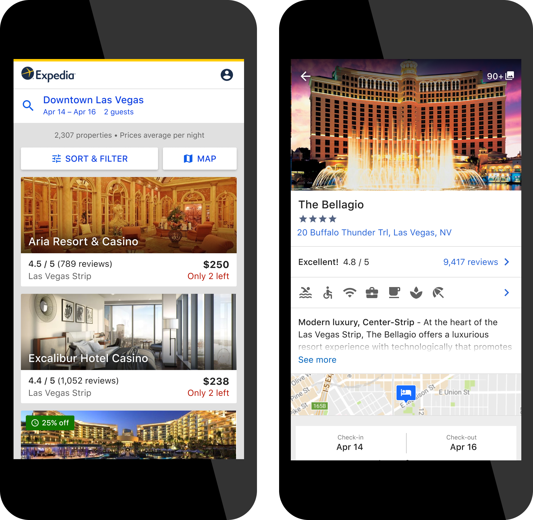
Left: Search Results view, Right: Product Details view
I served as the acting design lead, partnering with senior engineers, PMs, and our program lead to define experience strategy, prioritize UX impact, and shape component-level decisions that would scale beyond this initiative.
Expedia travelers are planners. They return dozens of times, often across devices, to compare prices, amenities, and availability. By 2016, the majority had shifted to mobile, yet our experience was underperforming: slow to load, unreliable, and visually cluttered.
"I would go to another website that is more user-friendly than Expedia!"
User Testing Participant, 2016
"It is taking a long time for the page to load after I make [filter] choice"
Quick Pulse Study, 2016
Example of poor performance on load and from one page to another
We kicked off in January 2017 and went live with our first booking on March 31, just 90 days later. The MVP intentionally launched with limited inventory, no account login, and reduced features. Within one week, we saw a 30% drop in bookings. It was a hard but expected signal: our travelers needed more functionality, and our platform needed fast iteration.
We met daily, sharing interactive prototypes and in-flight code. As soon as a feature was testable, we evaluated it for perceived speed, clarity, and impact.
Years of A/B tests had optimized individual UI elements, but left us with a fragmented experience. No fewer than 23 stakeholder teams had claims to test slots and content ownership. I worked across these teams to reset expectations and prioritize user-first reintegration, starting from a clean slate and bringing back only what added value across the journey.
We designed intentionally and tested fast:
Iterations to top of Product Detail view based off of the Search Results listing
Iterations to rooms and rates on Product Detail view
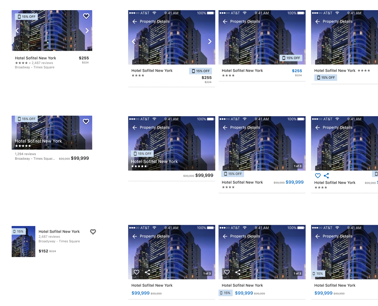
I conducted a full audit of deal types and influence messaging. Many badges were redundant or unclear. I introduced a simplified deal hierarchy to reduce visual noise, align with user expectations, and maintain partner visibility. I explored dozens of layout variants testing hierarchy, content grouping, and visual priority.

A snapshot of the rainbow view of deal messaging that could show up on a search result card

Audited and distilled the jobs for each deal type
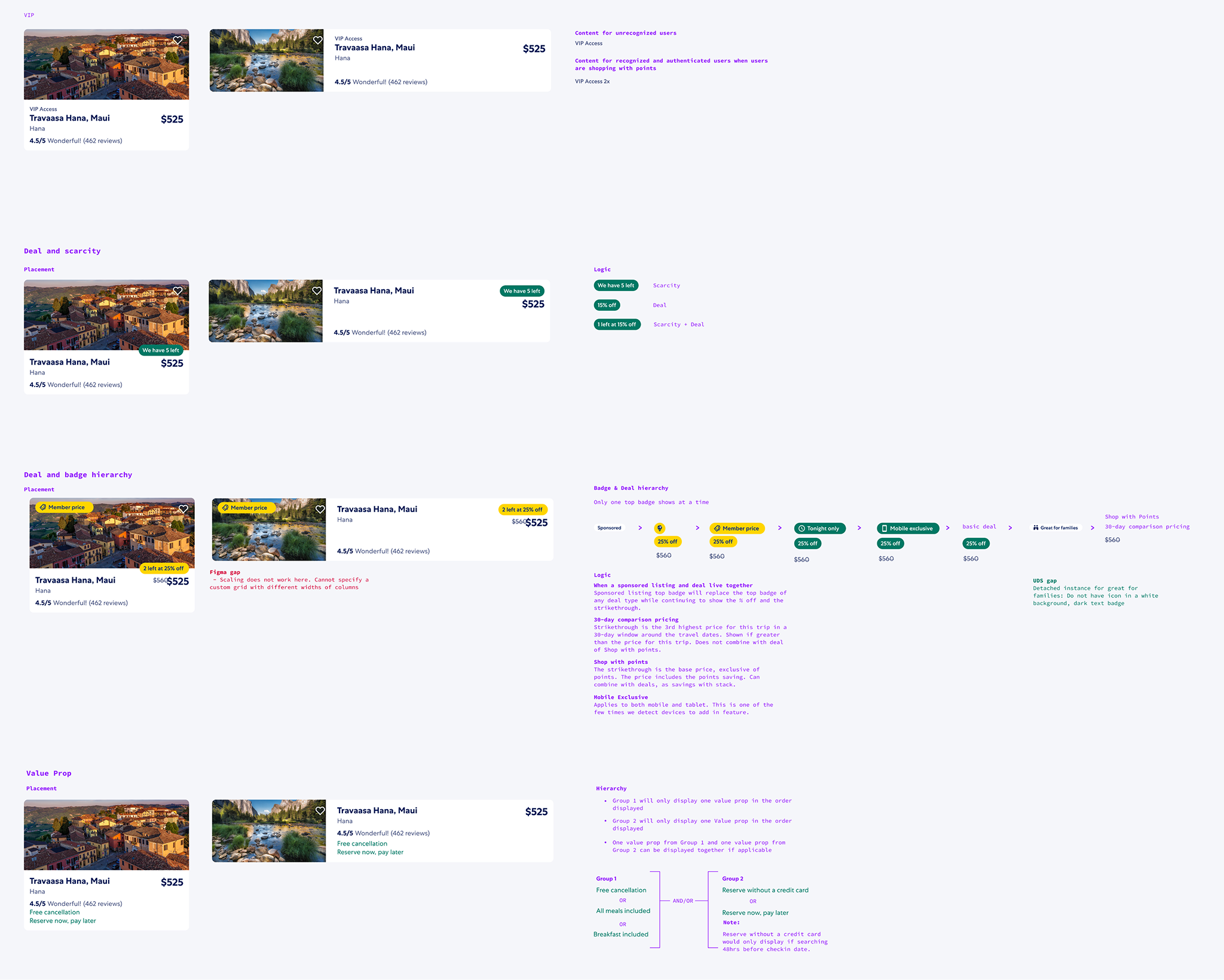
Final deal hierarchy examples and logic
We focused on optimizing the above-the-fold experience: global header, destination, dates, and initial listings. I partnered with engineering on server call sequencing and render prioritization. For elements that couldn’t load immediately, we held placeholder space to prevent layout shift and support early interaction.
Example of placeholder areas where known elements come in later
The metric we usually use to track progress is conversion (percentage of people who book). Because the new platform was so much more performant, we were getting far more visitors to our views, which meant that there would be a significant skew between the conversion of our old platform against the new platform. We decided to use purchaser gap, which is the percent change in the difference of purchasers between our new platform and old platform.
After proving success on mobile, we faced an increasingly fragmented traveler experience. The legacy desktop and tablet experiences were visually and functionally disconnected from our new PWA. Travelers often switched between platforms during their decision-making journey, losing continuity and confidence. Internally, our design and engineering teams were burdened with maintaining two codebases, two design patterns, and duplicated work.

I led experience strategy for the Product Details View on large screens and acted as the design lead for the overall effort, mentoring another designer on Search Results, partnering with engineering and advertising, and ensuring that the work scaled within and beyond lodging.
Expedia brand lives on an app and web platform. The PWA on mobile was beginning to close the gap between the app and web experience. The web version, in its best form, is built responsively; however, the approach to testing the new PWA was to restrict it to mobile-only. Once PWA on mobile web proved out, we now had the problem of a website living on two different platforms with two radically different experiences for our users. We know that our users typically do not stick to one platform and will come back more than 40 times to our site during their shopping process forcing them to reset every time they move from one platform or device to another.
In addition to our users feeling the burden of two experiences, our web designers and developers now had a second platform for which to design, develop, and maintain. It was not a healthy state for our teams and our users.
Disparate experiences between mobile PWA and desktop
We took a minimum-viable approach to start testing large screen traffic. Tablet traffic began on September 7 and showed promise:
We then enabled 2.5% of desktop traffic using only minimal styling updates: a full-width header and a constrained body column. It was not ideal, but usable. This gave us a baseline with:
Large screen micro test baseline of the large screen PWA
I audited the legacy platform, past usability pain points, and competitor flows, especially for the amenity dialog. We also reviewed over 30 past breakpoints and consolidated them into a standardized system later adopted by the design system.
Key design focus areas included the photo gallery and the room and rate section. I explored layout options that prioritized imagery while keeping performance top-of-mind. For complex room content, I optimized for 80% of property configurations and created fallback rules for outliers.
New breakpoint decisions allowed us to explore new layout options and responsive behaviors
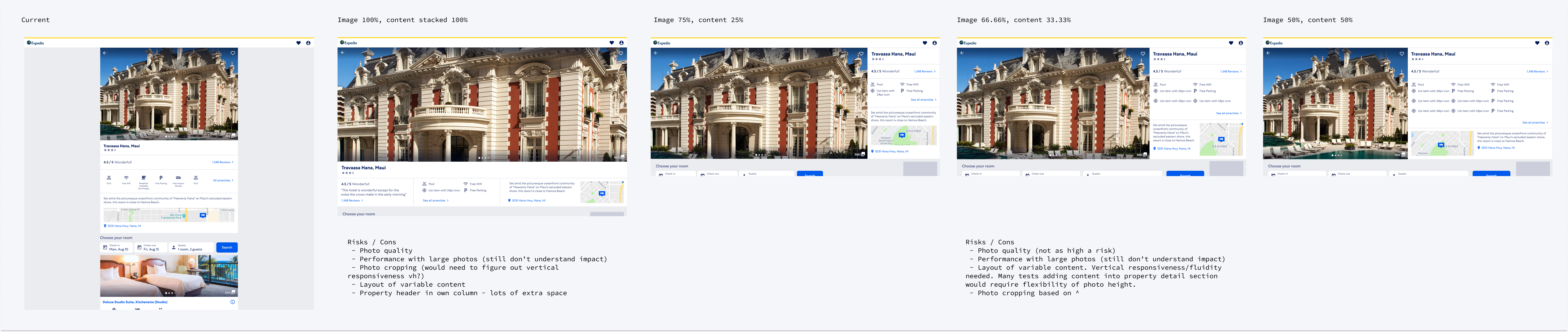
Product detail top of view layout explorations
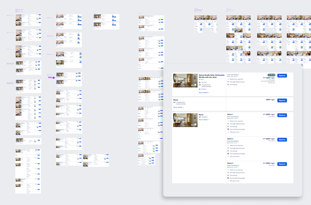
Rooms and rates explorations and optimization
In lab testing, the Product Details View performed well with a few minor issues one example being the lack of sort within the reviews section. We added these bugs to the list of follow-up items to tackle once we fixed the blocking issues. The research highlighted the majority of the ship-stopping bugs and interaction issues on the search results page, which is where we spent most of the post-research effort. One participant noted:
"I want to see the worst reviews but I can't see the 1-star review."
PWA Desktop Lab Study, November 2018
I'd like to call out the advertising process specifically because it required sustained collaboration, careful negotiation, and an unwavering focus on both user experience and business goals. Advertising was a critical revenue stream and a high-stakes stakeholder in the PWA large-screen rollout.
Both sides agreed that we could not scale past 5% of traffic without demonstrating that the new experience could reach ad revenue parity with the legacy platform. That meant integrating ads in a way that preserved their business value without degrading the performance, clarity, or trust of the traveler experience.
I worked across both the Search Results and Product Details views to:
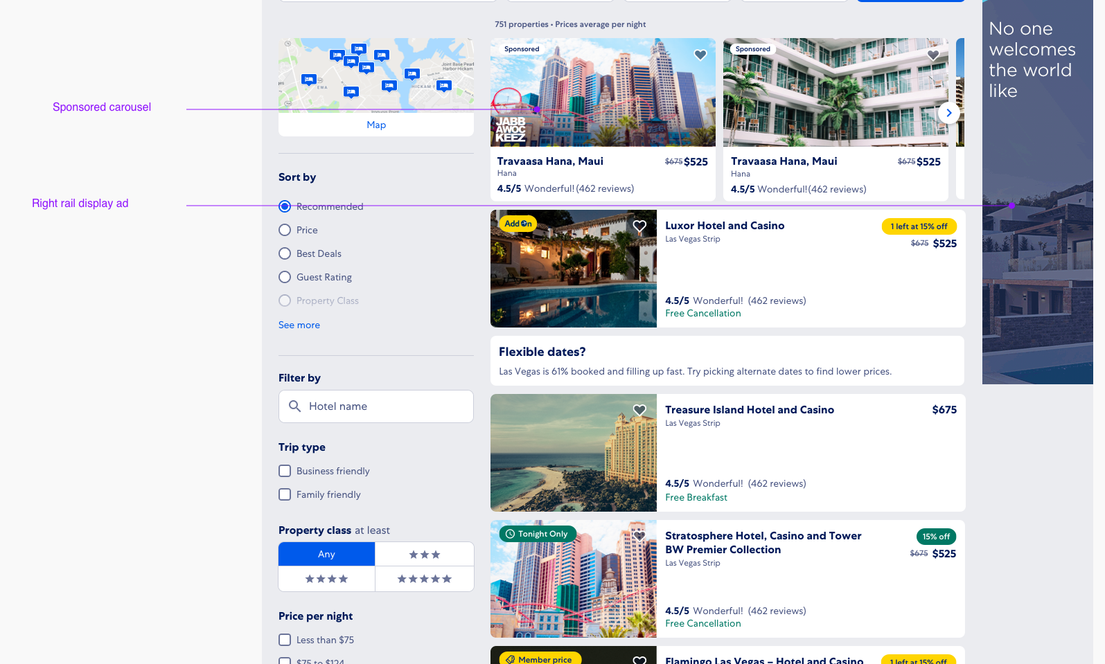
improving ad placement and asset quality
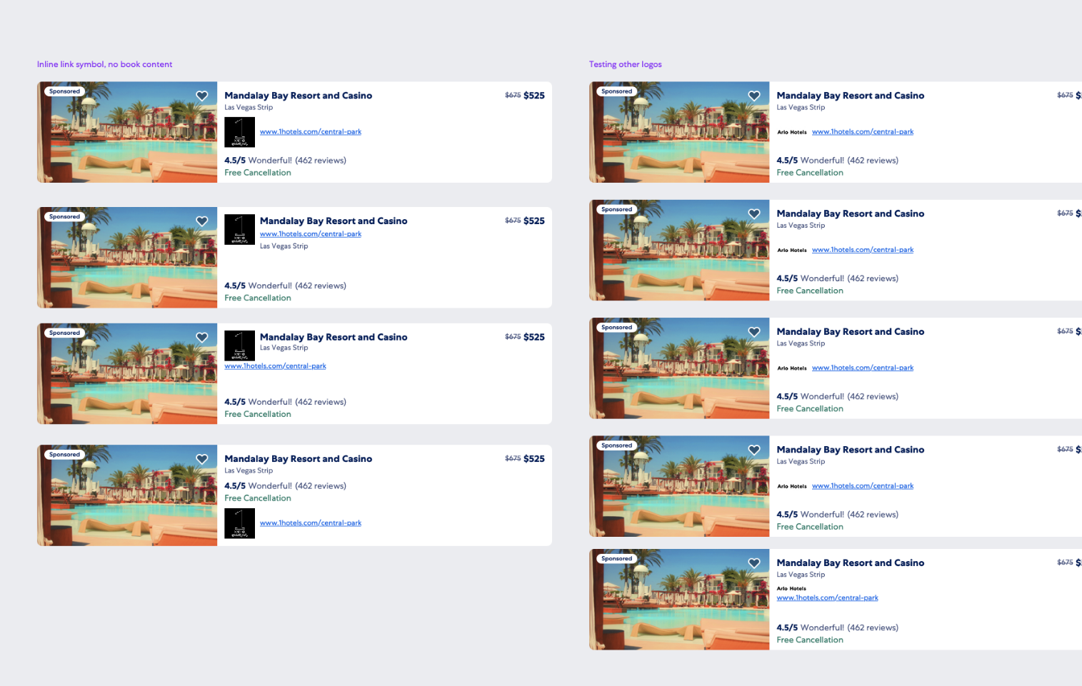
breakpoint and ad placement documentation
By treating ad design as part of the experience, not something layered on top, we were able to reach parity in both gross profit and partner exposure, while also removing patterns that had been shown to frustrate or confuse travelers.
This work contributed directly to our ability to scale traffic beyond the 5% threshold and helped establish a shared model for ad integration across responsive breakpoints.
This project reshaped how Expedia builds. What started as a mobile test became the foundation for a system-wide design strategy to bring performance, clarity, and trust to the traveler journey, while supporting the business through smart trade-offs and deeply collaborative execution.