Unifying Three Design Systems into One Scalable, Multi-Brand Platform
At Expedia Group, I led the transformation of multiple independent design systems into a single, scalable foundation-graduating over 40 legacy components into token-based, themeable assets that could be reliably used across 100 brands, 4 platforms, and countless channels. This initiative standardized how teams build UI across the organization, reduced duplication, and enabled faster, more confident delivery of design.
- Role
- Principal designer
- Duration
- 2 years
- Scope
- Unification of multiple design systems across 100+ brands, web, iOS, and Android into a single scalable foundation
- Impact
-
- 50+ components graduated in EGDS
- Reduced duplication and rework across teams
- Introduced governance and contribution model for system scale
Context
Expedia Group operated with multiple design systems across brands. The Unified Design System (UDS) supported a limited set of brands, while other flagship brands such as Vrbo, Hotels.com, and partner platforms maintained their own systems. As product and platform efforts began to converge, these differences became more visible and more costly.
Teams relied on their local systems to move quickly, but there was no shared foundation to support consistency across products or platforms. As a result, the organization was carrying increasing design and engineering debt as similar problems were solved repeatedly in different ways.
The Challenge
The system needed to scale across brands and platforms without slowing teams down.
Multiple brands, multiple platforms, and different product surfaces all needed to work from a shared foundation. The system had to reduce duplication, improve consistency, and align design and engineering around a common structure while still supporting teams moving quickly.
Key inflection points
Two moments during the work changed the direction and forced a shift in approach.
The first came when the scope expanded beyond traveler-facing experiences to include supplier product UI. Supplier workflows introduced more data-dense and highly interactive surfaces, including complex tables, interactive calendars, and infographics. Discovery expanded significantly and required deeper collaboration with supplier teams. The work shifted from consolidating similar systems to designing for very different product needs and negotiating what belonged in the shared system versus what needed to remain flexible.
The second came about a year into the effort, when the pace of progress became a problem. Completing the design work alone would have taken close to a full year. That timeline did not match the needs of the business or the direction of the platform.
I proposed a faster approach to move the work forward. The team shifted away from full component-by-component migration and focused on foundational primitives and higher-impact components. Without that change, the system would not have been ready to support platform convergence on the required timeline.
Approach
The team focused on building true foundational design system components that could support multiple brands and use cases instead of attempting to migrate every component. That shift allowed earlier delivery of value and created a structure that could scale more effectively over time. Component priorities aligned with key initiatives such as loyalty and platform convergence so the system supported the most important product work first.
A token-driven architecture separated visual decisions from component structure. Components could be themed consistently across brands without duplication or overrides. Governance and contribution models gave teams a clear path to contribute while maintaining quality and consistency. Readiness criteria, contribution guidelines, and shared documentation created structure without blocking teams.
The work stayed grounded in real product needs. Audits across existing systems identified duplication and gaps. Product teams provided real use cases and edge conditions. Engineering partners across web, iOS, and Android ensured that designs translated cleanly into implementation.
Execution
As Principal UX Designer, I defined the vision, strategy, and execution plan for unifying our legacy design systems into a single platform. I designed the graduation framework from the ground up and led the team in applying it across multiple component types, guiding how components were evaluated, rebuilt, and brought into the system.
I worked closely with designers across the team, setting direction and supporting them through complex component work while encouraging collaboration across product, brand, and platform teams. Regular working sessions and reviews created space for shared problem solving, especially as we navigated differences across brands and platforms.
Alignment across design, brand, and engineering leadership was critical to moving the work forward. I partnered closely with platform teams across web, iOS, and Android and brought designers into those conversations so decisions could be made with a clear understanding of both design intent and implementation constraints.
I led the re-architecture of components in Figma using modern practices such as auto layout and variants, and guided the team in adopting these patterns consistently. I also introduced semantic token mapping and authored the initial design token libraries, then worked with designers to expand and apply them across components to support multi-brand flexibility.
Scaling the work required more than component design. I created detailed checklists, educational materials, and documentation, and used them to onboard and support designers contributing to the system. This made it possible for the team to participate in the work while maintaining consistency and quality.
I served as the primary point of contact for cross-functional collaboration, running regular touchpoints to manage dependencies, support adoption, and advocate for platform needs. As the work evolved, I guided the shift toward primitives and higher-impact components, helping the team adjust quickly while staying aligned on the long-term direction.
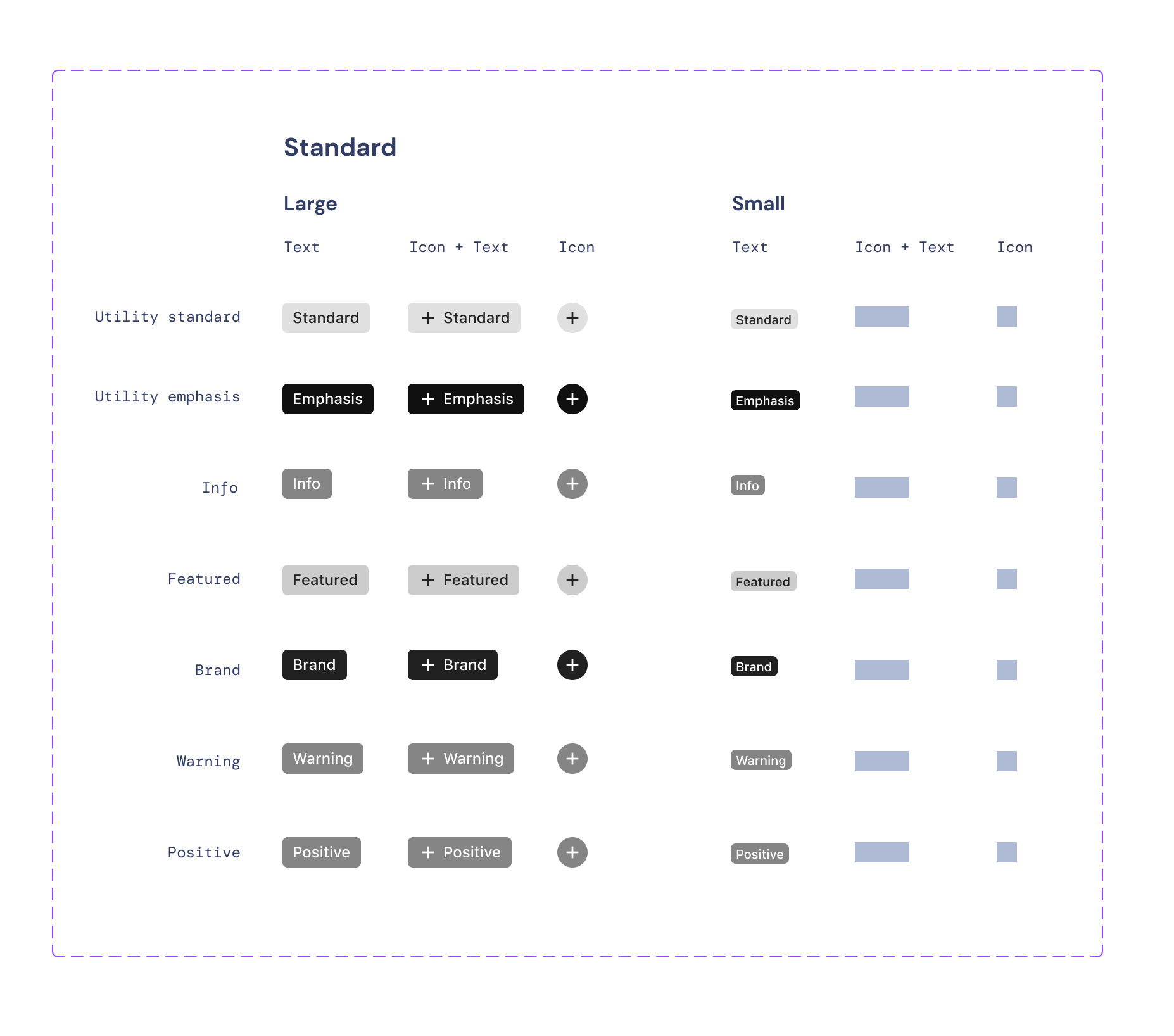
A Real-World Example: Badge
The Badge component illustrates how the work translated into practice.
Existing implementations across systems and products showed inconsistencies in taxonomy, styling, and usage. The team defined a clearer set of use cases and reduced the problem into something that could be standardized.
Variations were explored, token usage was mapped to support theming, and the component structure aligned with engineering expectations. The result was a single, reusable Badge component that worked across brands and contexts without requiring custom implementations.
The process established a repeatable pattern for designing, validating, and graduating components into the system.
Internal and external design system audits, product audit
Taxonomy, exploration, and discovery
Narrow and plan
Build and test
Token mapping for theming
Handoff and partnering with engineering
Final result - The graduated Default Brand "Badge / Standard"
Outcome
Over 50 components were graduated into EGDS, enabling consistent usage across Expedia Group’s brands and platforms, including web, native, and email.
A shared token library reduced reliance on overrides and supported scalable theming across brands. Designers and engineers worked from a common set of components and standards, which reduced rework and improved delivery speed.
Teams aligned around a shared framework and governance model. Adoption increased as the system became more reliable and easier to use.
The focus on primitives positioned the system to support cross-brand initiatives such as loyalty and membership and aligned the system with broader platform efforts.